Are you looking for the complete WordPress mobile optimization guide? If you are, keep reading this article. Here, we will show you how to improve mobile page speed and core web vitals.
People often use mobile devices for browsing. Studies say more than 60% of internet users use mobile devices. Hence, your website must be optimized for mobile devices if you are a blogger or business owner and need to optimize your ranking, conversions, and revenue.
It is suitable for core web vitals and Google PageSpeed Insights scores.
If you are wondering how you can turn your existing website or WooCommerce store into a mobile-friendly website, keep reading this guide.
What is Mobile Optimization?
Mobile optimization refers to the process of ensuring that your website performs efficiently and looks great on mobile devices like smartphones and tablets. This involves responsive design, fast loading times, optimized images, and smooth navigation to provide a seamless user experience for mobile visitors.
Here, I will show you the best optimization techniques for improving your website’s mobile performance.
First, let’s see why mobile optimization matters.
☲ Table of Contents
- Why You Should Optimize WordPress Website for Mobile Devices
- How to Test Mobile Page Speed
- How to Optimize WordPress Website for Mobile Devices: 13 Strategies for Quick Win
- 1. Use a Responsive WordPress Theme
- 2. Choose the Fastest Hosting
- 3. Optimize Images for Mobile and Serve via CDN
- 4. Improve Time To First Byte
- 5. Eliminate Render-Blocking Resources (JS and CSS)
- 6. Reduce Page Size (Weight)
- 7. Enable Lazy Loading
- 8. Minimize CSS and JavaScript Files
- 9. Leverage Content Delivery Networks (CDNs) – Deliver Full-page Cached Pages via CDN
- 10. Manage and Display Ads Efficiently
- 11. Implement Accelerated Mobile Pages (AMP)
- 12. Optimize Your Mobile Navigation
- 13 Use WordPress Caching
- Common Mistakes You Need to Avoid
- Frequently Asked Questions
- How Can I Optimize My WordPress Site for Mobile Devices?
- What Is the Best Way to Improve Mobile Load Times in WordPress?
- Why Is Core Web Vitals Important for Mobile Users?
- Does Using a Responsive Layout Improve SEO?
- What Tools Can Help Optimize Mobile Performance in WordPress?
- How Does Lazy Loading Benefit Mobile Optimization?
- Is a Mobile-Friendly Site Necessary to Rank Well in Search Engines?
- Can a Content Delivery Network (CDN) Help With Mobile Optimization?
- How Do Screen Sizes Affect Website Optimization?
- Conclusion
Why You Should Optimize WordPress Website for Mobile Devices
With more users browsing the web on mobile devices than ever before, having a mobile-optimized site isn’t optional anymore.
It’s essential.
Benefits of Mobile Optimization
- Faster loading speeds on mobile devices
- Improved user experience and engagement
- Higher search engine rankings due to better Core Web Vitals
- Reduced bounce rates on mobile traffic
- Increased conversion rates from mobile visitors
Mobile users expect a smooth user experience, and even a slight delay in loading speed can lead to frustration and site abandonment.
A responsive layout tailored for mobile screens ensures your content is easily accessible on all devices, improving user engagement and reducing bounce rates.
Optimizing your WordPress site for mobile also directly impacts your Core Web Vitals, an essential factor in Google PageSpeed Insights and search engine rankings.
A responsive theme, faster loading times, and reduced assets for slower connections all contribute to a better mobile version of your site.
Tools like PageSpeed Insights can help identify specific improvements to boost mobile performance and create a positive user experience on all screen sizes.
Now you know why you should optimize your WordPress website for mobile screens. The next section will show you the top 13 ways you need to know for WordPress mobile optimization.
How to Test Mobile Page Speed
First, let’s see how to test the mobile page speed of a website. There are multiple tools available for this task. But we will be using:
- Google PageSpeed Insights
- WebPageTest
How to Test Mobile Page Speed – Step-by-Step
- Visit Google PageSpeed Insights.
- Enter your website URL and select the “Mobile” tab.
- Click “Analyze” to get detailed speed reports and suggestions.
- Alternatively, visit WebPageTest.
- Enter your URL, select a mobile device and location, then start the test.
- Review results focusing on metrics like Largest Contentful Paint (LCP), First Input Delay (FID), and Time to First Byte (TTFB).
We have implemented all these mobile optimization methods in techNumero, and we recommend you use the same.
Let’s see how each tool can help us.
1. Google PageSpeed Insights
Google PageSpeed Insights is one of the best tools to track the desktop and mobile performance of a website.
Here is how we use the tool to test the mobile optimization score of our site, technumero.com.

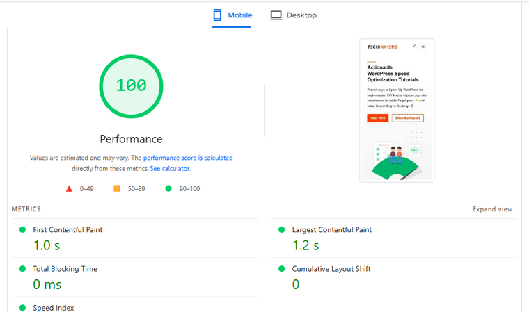
Just ensure that you have selected the mobile option, and you will be able to view the results.
2. WebPageTest
Now, let’s test technumero.com on the WebPageTest tool.
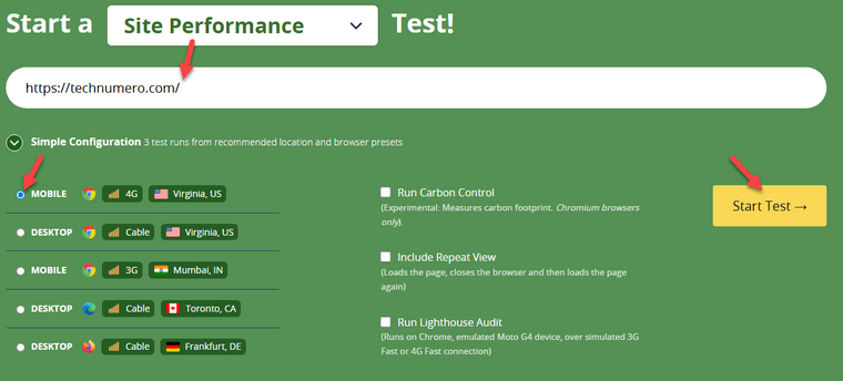

As you can see, the results are now available. However, you can also try switching to another location and rerunning the test for more comprehensive results.
How to Optimize WordPress Website for Mobile Devices: 13 Strategies for Quick Win
In a nutshell, the methods are:
- Use a Responsive WordPress Theme
- Choose the Fastest Hosting
- Optimize Images for Mobile and Serve via CDN
- Improve Time To First Byte
- Eliminate Render-Blocking Resources (JS and CSS)
- Reduce Page Size (Weight)
- Enable Lazy Loading
- Minimize CSS and JavaScript Files
- Leverage Content Delivery Networks (CDNs) / Deliver Full-page cached Pages via CDN
- Manage and Display Ads Efficiently
- Implement Accelerated Mobile Pages (AMP)
- Optimize Your Mobile Navigation
- Use WordPress Caching
Below, we will explain how these things can help you with the loading speed of your website.
1. Use a Responsive WordPress Theme
A responsive WordPress theme is essential for delivering a seamless experience across various screen sizes and mobile devices.
These themes automatically adjust layout elements such as menus, images, and content blocks to ensure everything displays correctly on smartphones and tablets.
Choosing a responsive theme helps eliminate the need for a separate mobile version of your site, simplifying management and improving consistency.
When your site is responsive, users won’t need to zoom or scroll excessively, contributing to a positive user experience.
A responsive design not only improves user experience but also enhances your site’s mobile SEO by ensuring compatibility with Google’s mobile-first indexing, as search engines prioritize mobile-friendly websites in mobile search results.
Many modern themes in the WordPress repository and premium marketplaces now come with responsive design as a default feature.
Before activating a theme, test its responsiveness using tools like Google’s Mobile-Friendly Test or simply by resizing your browser window.
Here are some responsive themes you can use:
In our case, we are using the GeneratePress WordPress theme with the GenerateBlocks plugin.
2. Choose the Fastest Hosting
Your hosting provider plays a significant role in how fast your WordPress site loads on mobile devices.
A slow server can cancel out all your optimization efforts, no matter how well you compress images or minify code.
Look for WordPress-optimized hosting solutions that offer server-side caching, CDN integration, and built-in performance tools.
These features can significantly reduce load times and improve mobile responsiveness.
Some of the best performance-optimized WordPress hosting companies are:
Selecting performance-optimized hosting reduces server response times, which is crucial for improving Time To First Byte (TTFB) and overall mobile page load speed.
For TechNumero, we are using Rocket.net. As you can see in the screenshot below, we have a good score for the mobile experience.

3. Optimize Images for Mobile and Serve via CDN
Images are often one of the largest elements on a WordPress website, and if not properly optimized, they can drastically slow down loading speeds.
To improve mobile performance, it’s essential to convert your images to efficient formats like WebP.
This modern format provides superior compression while maintaining visual quality, helping your site load faster without compromising aesthetics.
The next step is compressing the images.
By using external tools or WordPress plugins like Smush or ShortPixel that compress images without significant quality loss, you can significantly reduce file sizes and speed up mobile load times.
You should check out our complete guide on WordPress Image Optimization for more details.
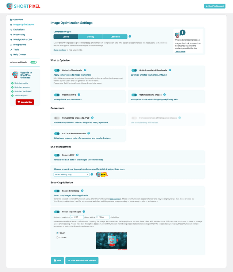
You can also track how much data you saved from the dashboard.
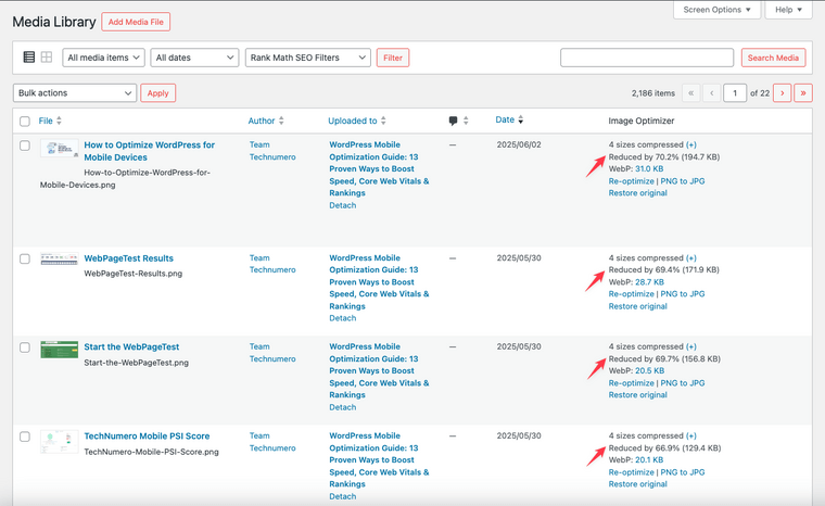
Also, always resize your images to match their intended display dimensions before uploading.
Avoid uploading full-resolution images that get downsized by HTML or CSS, as they unnecessarily consume bandwidth and slow down performance.
To further improve image load times on mobile, consider using a Content Delivery Network (CDN).
When a user visits your site, the CDN delivers these assets from the nearest server, significantly reducing latency and speeding up load times.
This is especially beneficial for mobile users who may rely on slower connections. Popular CDN services like Cloudflare, BunnyCDN, and KeyCDN integrate easily with WordPress and often offer built-in image optimization features.
Pairing a CDN with optimized images ensures that your mobile visitors receive the fastest and most responsive experience possible.
4. Improve Time To First Byte
Time To First Byte (TTFB) reflects how quickly your server starts delivering content after a user requests a page.
It’s a critical metric, especially for mobile users who are more likely to abandon sites with slow server response times.
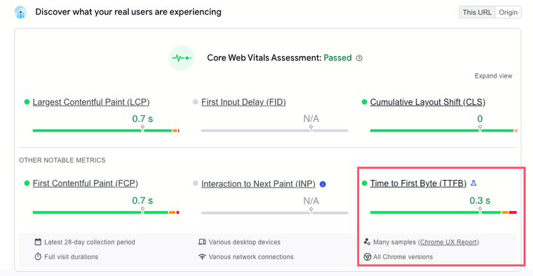
Improving TTFB requires optimizing everything between the browser request and the first byte served.
Start by investing in a performance-optimized WordPress host.
Providers like Rocket.net, Kinsta, or WP Engine offer faster response times thanks to dedicated resources, optimized PHP handling, and built-in caching.
Avoid overloaded shared hosting at all costs.
Next, implement full-page caching to reduce the need for dynamic content generation. Tools like WP Rocket or LiteSpeed Cache can deliver static pages instantly, cutting down TTFB significantly.
For dynamic sites, enabling object caching with Redis or Memcached can also improve database response time.
Lastly, use a CDN that supports edge-level full-page caching.
Instead of waiting for your origin server to respond, services like Cloudflare or Bunny.net can serve pages directly from the nearest edge location, reducing TTFB globally.
This way, you can optimize your TTFB score.
5. Eliminate Render-Blocking Resources (JS and CSS)
Render-blocking JavaScript and CSS files delay how quickly your content appears on mobile devices. Until these files are downloaded and processed, the browser can’t render the page.
To optimize these resources, start by deferring non-critical JavaScript. Most caching and performance plugins like WP Rocket, FlyingPress, or LiteSpeed Cache include options to delay JavaScript execution until after user interaction.
Here’s how to defer JS using FlyingPress:
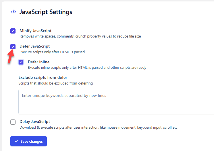
This ensures scripts don’t compete with your main content during page load.
For CSS, consider generating and inlining critical CSS. This allows the browser to render above-the-fold content immediately, while the rest of the styles load asynchronously in the background.
Many performance plugins can automate this process, removing the guesswork. With the right configuration, it is achievable.

Also, avoid plugins and themes that load large, all-in-one style sheets across every page. Modular loading or conditional asset loading is far more efficient and mobile-friendly.
6. Reduce Page Size (Weight)
Page weight has a direct impact on mobile performance. Heavier pages mean longer load times, increased bounce rates, and worse Core Web Vitals scores.
While desktop users may have the resources to handle larger pages, mobile users often face slower connections and data limits. To reduce page size without compromising functionality or design:
- Remove unnecessary assets – Many themes and plugins load unused CSS, JavaScript, or fonts. Use tools like Perfmatters or Asset CleanUp to dequeue what’s not essential.
- Avoid bloated page builders – If you’re using Elementor, WPBakery, or similar tools, be strategic. Disable unused widgets and turn off features you don’t need globally.
- Minimize third-party scripts – Tracking scripts, chat widgets, and social media embeds can bloat mobile pages fast. Only keep what’s critical for user experience or business goals.
- Inline critical CSS and load the rest asynchronously. This reduces render-blocking resources and gets your mobile content visible faster.
You can use a WordPress performance plugin, such as Perfmatters, WP Rocket or FlyingPress, to optimize the scripts.
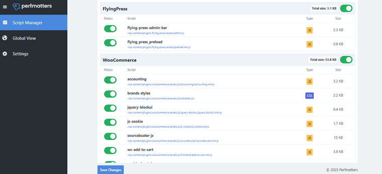
Here’s the GTmetrix waterfall chart after disabling unwanted scripts:

7. Enable Lazy Loading
Lazy loading is a technique that delays the loading of images and other media files until they are needed. Instead of loading all visual elements when the page loads, lazy loading allows media to appear only when a user scrolls to them.
Lazy loading defers offscreen content loading, reducing initial page weight and bandwidth usage, one of the key factors in enhancing Core Web Vitals on mobile devices. This can drastically improve loading times on mobile devices where bandwidth and speed can be limited.
Enabling lazy loading in WordPress reduces the initial page size, which helps improve mobile speed, lowers server response time, and provides a smooth browsing experience for mobile users.
Most modern WordPress themes support native lazy loading, but you can use performance plugins like WP Rocket, LiteSpeed Cache, or Perfmatters to implement advanced lazy loading features.
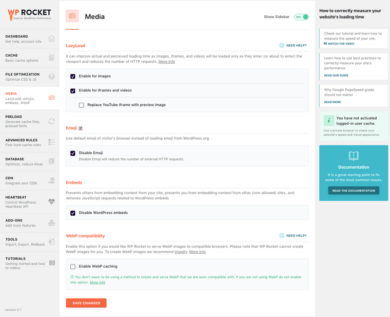
These plugins can even help lazy load background images, iframes, and videos.
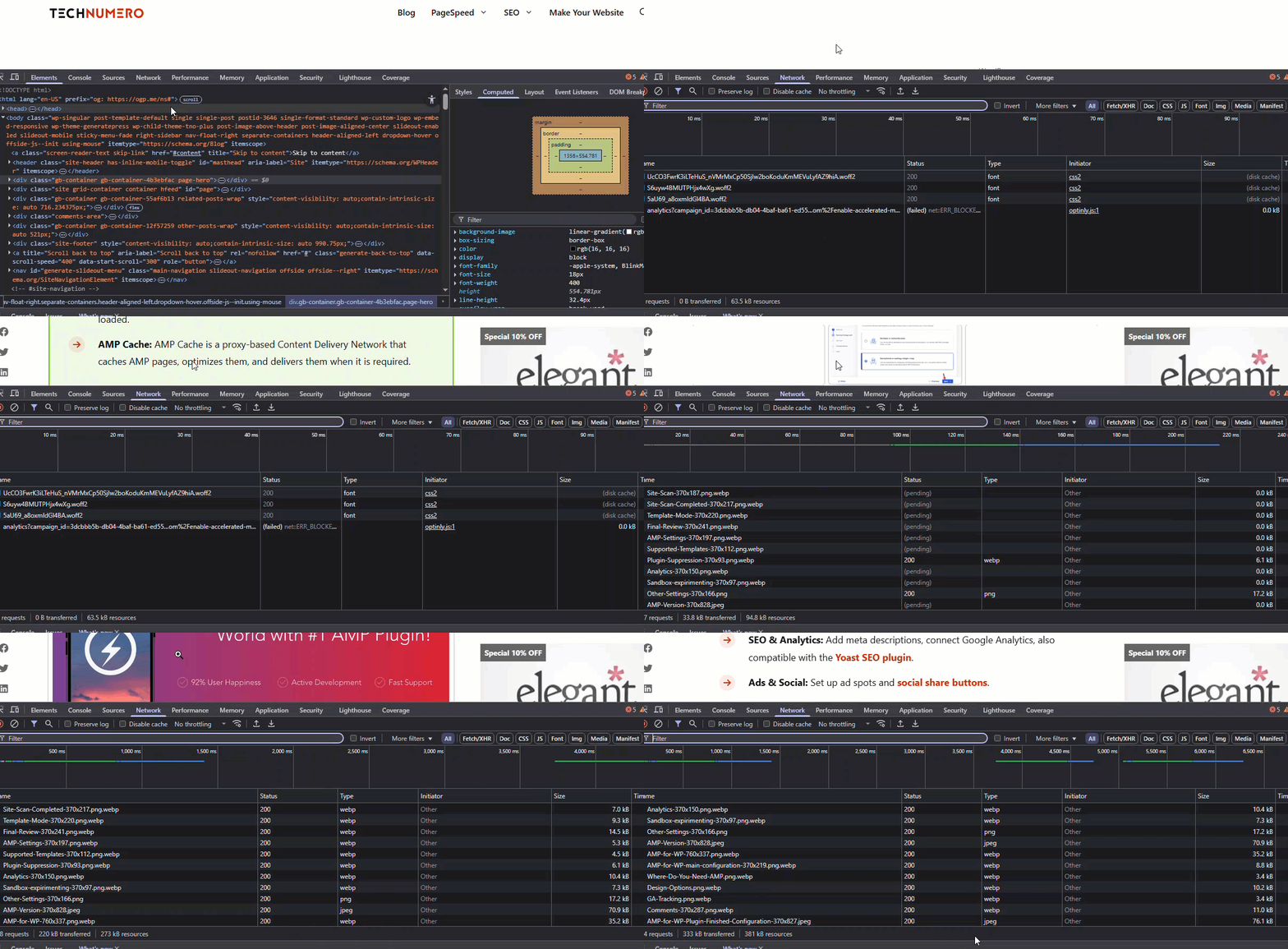
As you can see above, the images are loading as we scroll down.
8. Minimize CSS and JavaScript Files
Large CSS and JavaScript files can significantly slow down your WordPress site on mobile devices, especially when users are browsing over slower mobile networks.
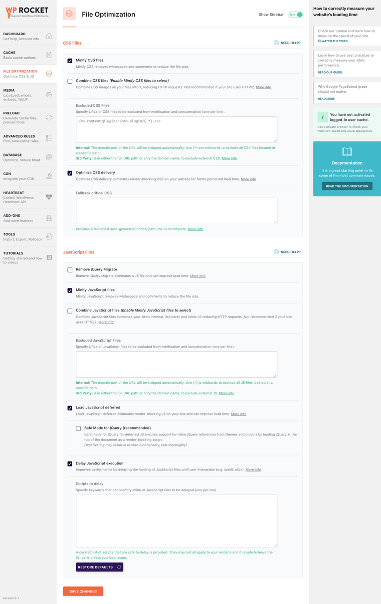
Minimizing these files helps reduce the overall page size, which leads to faster loading times and better performance on mobile screens. You can achieve this by removing unnecessary code, whitespace, and comments from your CSS and JavaScript files.
This not only improves your site’s speed but also positively impacts Core Web Vitals and user experience. Plugins like Autoptimize, Flyingpress, Perfmatters, WP Rocket, or LiteSpeed Cache make it easy to minify these files without needing to manually edit them.
Here are the ideal WP Rocket minification options.
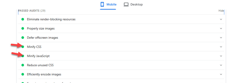
Always remember to test your site using tools like Google PageSpeed Insights after making changes to ensure everything still works correctly.
9. Leverage Content Delivery Networks (CDNs) – Deliver Full-page Cached Pages via CDN
When mobile users visit your WordPress site, a CDN serves static assets like images, CSS, JavaScript, and fonts from the nearest server, significantly improving mobile page speed and reducing latency.
Using a CDN minimizes server response time and reduces the load on your origin server. This leads to faster loading and smoother performance, especially for visitors accessing your site on slower mobile networks.
With a CDN, your WordPress site can better handle high traffic volumes and deliver a consistent experience across various screen sizes and regions.
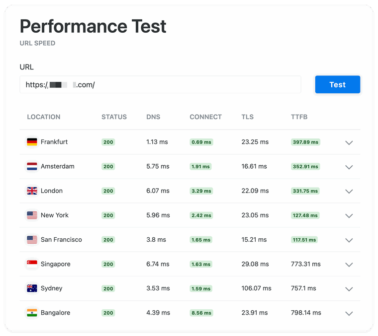
Also, with the in-built caching system of the CDN, you can boost your website’s traffic by serving cached files without requesting files from your database every time there is a visitor.
Many popular CDN services, such as Cloudflare, Bunny.net (we use it), and KeyCDN, also offer performance and security features, including DDoS protection, file minification, and real-time caching.
10. Manage and Display Ads Efficiently
Improper ad implementation is one of the most overlooked causes of poor mobile performance in WordPress.
Ads that load late, reflow content, or rely on excessive external scripts can significantly impact metrics such as Largest Contentful Paint (LCP) and Cumulative Layout Shift (CLS).
To optimize ad performance for mobile:
- Limit the number of ad units on mobile. Use responsive ad logic to serve fewer, lighter ads on smaller screens.
- Load ads asynchronously to prevent them from blocking rendering. Avoid inline scripts that delay content from being displayed.
- Avoid placing ads above the fold on mobile. Let your main content load first to improve perceived performance and LCP scores.
- Test and measure with real devices. Use Chrome DevTools or PageSpeed Insights to track how ads affect mobile metrics, especially CLS and total blocking time.
If you use AdSense or similar platforms, ensure that you disable auto-ads for mobile or control them with strict placement rules.
Consider integrating a performance-focused ad manager plugin like Ad Inserter or AdSanity that supports lazy loading, script deferral, and caching compatibility.
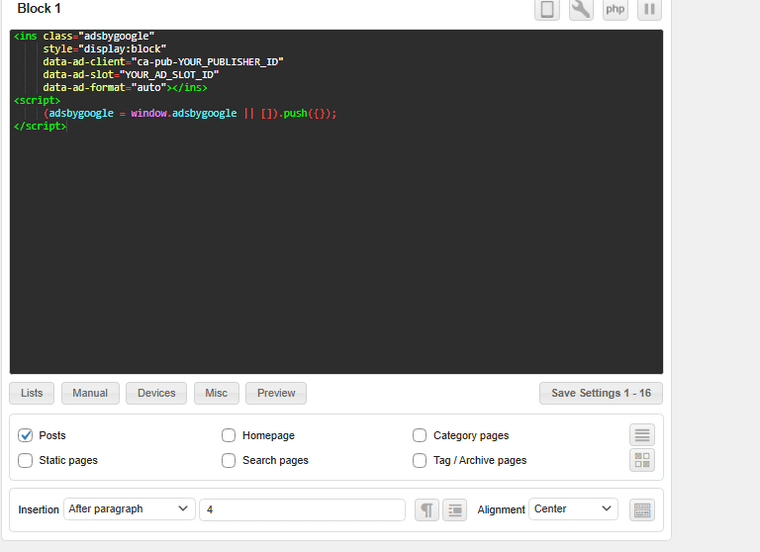
When monetization interferes with the user experience (UX), it ultimately hurts both performance and revenue.
A balanced, data-driven approach ensures your ads don’t sabotage your mobile experience.
To optimize your ads.js files and similar external HTTP requests, you can use a plugin like FlyingPress.
11. Implement Accelerated Mobile Pages (AMP)
Implementing Accelerated Mobile Pages (AMP) is an effective way to improve your WordPress site’s loading speed on mobile devices.
AMP is a lightweight framework developed by Google that strips down unnecessary elements, enabling pages to load almost instantly.
By using AMP, you can significantly reduce mobile load times, which enhances user experience and can positively impact your search engine rankings.
To add AMP functionality to your WordPress site, you can use plugins like the official AMP plugin or third-party plugins that offer more customization.
These plugins automatically generate AMP-compatible versions of your content, ensuring faster rendering without needing to build separate mobile pages.
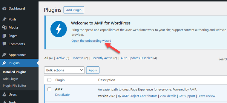
Incorporating AMP also helps with better performance in Google’s mobile-first indexing and can improve your site’s visibility in mobile search results.
Check out this article to learn more about adding AMP to your WordPress website or WooCommerce store.
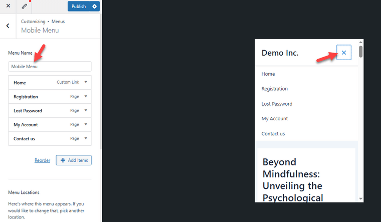
A smooth and easy-to-use navigation system is crucial for mobile users. Optimizing your mobile navigation means creating menus that are simple, fast to load, and easy to tap.
Avoid complex dropdowns or too many menu items, which can overwhelm small screens and slow down the user experience.
Using a clean, responsive menu that adapts well to different mobile screen sizes helps visitors find what they need quickly, boosting engagement and reducing bounce rates.
Plus, consider adding a sticky or collapsible menu that stays accessible without taking up too much screen space.
This improves mobile usability and contributes positively to your mobile page speed by reducing unnecessary page elements that could slow down loading times.
13 Use WordPress Caching
Caching plays a critical role in improving mobile speed and delivering a smoother experience for users on mobile devices.
When properly configured, mobile caching can significantly reduce server response time by storing static files like images, CSS, and JavaScript, so they don’t have to load from scratch on every visit.
Popular cache plugins like FlyingPress, WP Rocket, and LiteSpeed Cache make it easy to enable browser caching and optimize performance for mobile users.
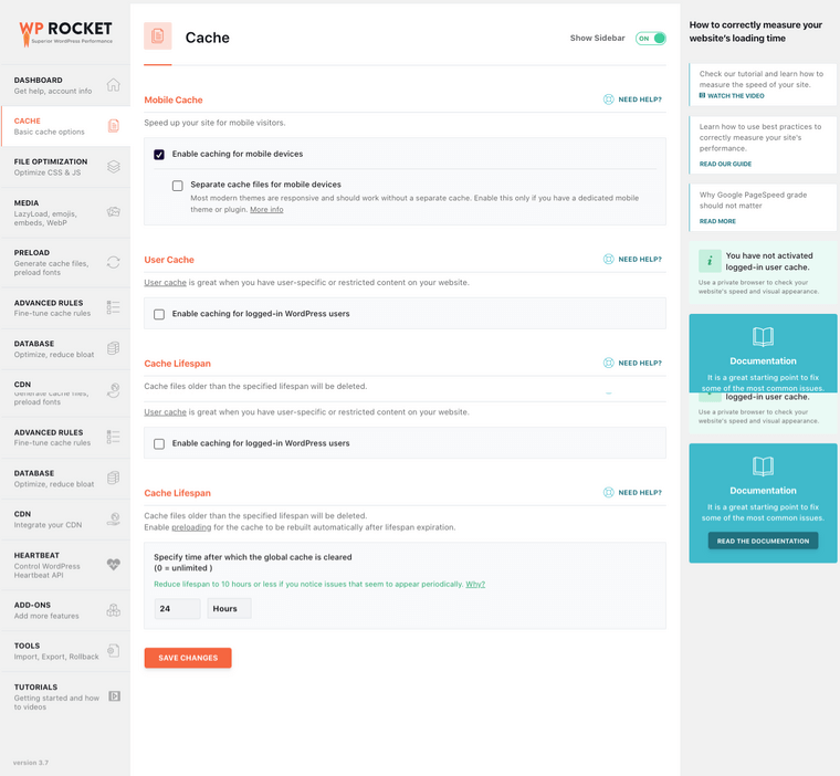
These plugins allow you to create separate cache versions for mobile layouts, ensuring consistent performance regardless of the device type.
If you’re experiencing slow site speed, implementing caching is one of the most effective solutions.
It’s a good idea to regularly evaluate your site using a performance testing tool like GTmetrix or Pingdom to ensure that your mobile page speed remains optimized.
Here are some popular caching plugins and their setup guides:
Common Mistakes You Need to Avoid
Next, let’s take a look at some of the common mistakes you need to avoid:
- Ignoring Mobile Responsiveness: Using a theme that’s not mobile-friendly can break layouts on smaller screens, leading to poor usability and increased bounce rates.
- Overlooking Image Optimization: Large, uncompressed images slow down load times on mobile connections. Always use compressed and properly sized images tailored for mobile screens.
- Using Too Many Plugins: Installing too many or poorly coded plugins can bloat your site, increase load times.
- Blocking Essential Scripts or CSS: Restricting critical CSS or JavaScript files in your robots.txt file can prevent mobile pages from rendering correctly, affecting layout and functionality.
- Not Setting Up Lazy Loading: Without lazy loading, mobile users may be forced to download all media simultaneously, which hurts loading speed and increases data usage. Use the WP Rocket or FlyingPress to lazy load images.
- Ignoring Core Web Vitals: Not paying attention to metrics like Largest Contentful Paint (LCP) and First Input Delay (FID) can lead to subpar mobile performance and lower search rankings.
Frequently Asked Questions
Next, let’s see some frequently asked questions regarding the topic.
How Can I Optimize My WordPress Site for Mobile Devices?
You can optimize your WordPress site by using a responsive theme, enabling lazy loading, minimizing load times, and testing your site with Google PageSpeed Insights or similar tools.
What Is the Best Way to Improve Mobile Load Times in WordPress?
Use caching plugins, compress images, implement a content delivery network (CDN), and reduce the number of external scripts to achieve faster load times.
Why Is Core Web Vitals Important for Mobile Users?
Core Web Vitals directly affect the mobile user experience and search engine rankings. Meeting these metrics ensures a smoother, faster experience on mobile devices.
Does Using a Responsive Layout Improve SEO?
Yes. A responsive layout ensures that your site looks good on all screen sizes, which improves user engagement and helps with rankings in search engines.
What Tools Can Help Optimize Mobile Performance in WordPress?
Tools like PageSpeed Insights, GTmetrix, and mobile emulators help identify performance bottlenecks and track mobile load time improvements.
How Does Lazy Loading Benefit Mobile Optimization?
Lazy loading delays loading off-screen content until needed, reducing initial load time and improving the mobile browsing experience.
Is a Mobile-Friendly Site Necessary to Rank Well in Search Engines?
Absolutely. Search engines like Google prioritize mobile-friendly sites, and mobile optimization directly impacts search engine rankings.
Can a Content Delivery Network (CDN) Help With Mobile Optimization?
Yes. A CDN speeds up content delivery across global regions, leading to faster load times and a more consistent mobile experience.
How Do Screen Sizes Affect Website Optimization?
Designing for various screen sizes ensures better readability and usability for mobile users, improving overall satisfaction and performance metrics.
Conclusion
Optimizing your WordPress website for mobile users is essential to avoid slow loading times that can frustrate visitors and harm your search engine rankings.
Mobile sites with slow load times risk losing valuable traffic, but a responsive theme, fast hosting, and WordPress optimization plugins can significantly improve initial page load times and overall speed on mobile devices.
Ensuring your site has a responsive design and mobile-friendly layouts will create a seamless experience for mobile users, enhancing engagement and retention.
As you can see, this article covered the best methods to optimize your WordPress website for mobile. So, we highly recommend implementing these on your website and testing the results afterward.
Do you know other methods to speed up a WordPress website on mobile devices?
Let us know in the comments.






Thanks for awesome article for WordPress
Any mobile specific theme recommendation?
Thanks in advance.
your blog website optimize for mobile users is very informative. for me, it is very renewable.
Thank you for theses tips. I was wondering if any mobile theme, or AMP i should use for more optimization.
Hey thank for the article,
I was looking to improve the interface of the mobile version of my website and thanks to your article, now i know where to begin with.
You have really helped me to optimize my site for mobile. My Google PageSpeed score has been increased, more than 90.
Hello,
Thanks for sharing 7 Quick Tips to Optimize WordPress Website for Mobile Users…It really helpful to me…I follow your steps for better results. Thanks for sharing valuable information with us…
superb article for wordpress and provide very helpful information thank you
Hi
Thanks for this helpful article. I am going to implement it on my blog.
Hi,
Great article
Thanks for sharing information about wordpress, keep post
Good content, good post. All is useful.
Great advice. Will try those tips and report back.
Superb Article. Will surely implement it.
All info written perfectly I appreciate it. Please keep writing like this and update us. Thanks!
Most visitors are from mobile devices so it is absolutely essential to optimize for the mobile. Thank you so much for providing these tips. This is a very informative post.